5 Psychology-Backed Design Tips to Dramatically Improve Your Blog Engagement - DailyBlogTips |
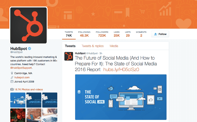
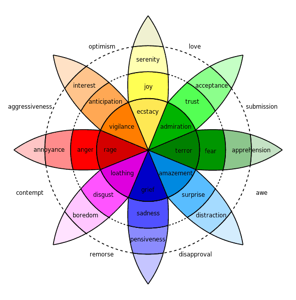
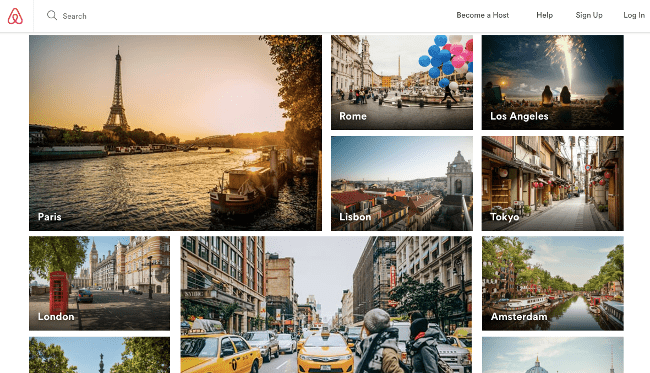
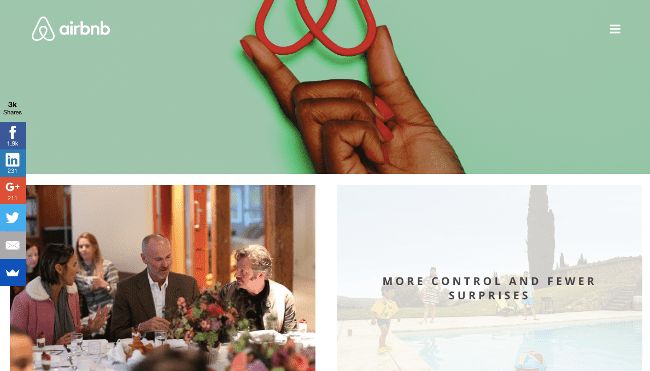
| 5 Psychology-Backed Design Tips to Dramatically Improve Your Blog Engagement Posted: 17 Nov 2016 06:12 AM PST Why do people read blogs? In some cases, they're looking for information. In others, they're looking for things to buy. Sometimes, they just want to be entertained. No matter what the case may be, one thing is certain: when people find that perfect blog, they stick with it – coming back day after day to read, comment, and share. The question is, though, how you become that blogger. If you're looking for ways to boost your blog engagement and entice your readers to stick around, the answer may be as simple as tapping into your readers’ psychology to make your entire site more compelling from the inside out. Read on. How Your Blog’s Design Affects its MessageLet's face it: people don't base their opinions of your blog solely on the words that you use. Instead, they look at the whole picture: the layout, formatting, and design of your blog, as well as the content. While most people assume they don't need a beautiful blog, a beautiful blog layout can provoke powerful subconscious reactions in your customers. In addition to the fact that a well-designed blog looks more professional, it's also more compelling, which makes readers more likely to convert. Want a Bigger Blog Engagement (Starting Right Now)? Try These 5 Science-Backed Design Tips for So, you want to offer the whole package – amazing content and a beautiful layout, but how do you do it? According to Neil Patel, the best approach is through psychology. Here are five science-backed design tips that you can apply to your blog, starting right now. 1. Choose your colors according to the emotions you want your visitors to feelDid you know that color has the potential to influence mood? Some of the biggest bloggers out there know this. Take a look at Moz, for example, which uses a color scheme of blue and white: There's also HubSpot, which relies on orange, white and gray: According to various scientific studies, colors have a large impact on the way people think and feel. For example, one experiment conducted in Glasgow, Scotland found that adding blue-tinged (a color associated with peacefulness) streetlights to crime-prone areas decreased the crime rate. Other studies have found that red increase the rapidity and force of a person's reactions. With this in mind, consider what emotions you want to convey through your blog design before you choose your color scheme. To help you decide, here’s a breakdown (courtesy of Robert Plutchik's color wheel) of various colors and the emotion associated with them: 2. Use images to make your readers have a physical reactionVisuals are powerful, and they make a large difference in the way people perceive blogs. While people remember only 10% of what they read, they remember 65% of what they see. The reason for this is simple: a picture is worth a thousand words and a quick glimpse at an image can fill us with emotions ranging from happiness to anguish, and everything in between. With this in mind, make the most of visuals to evoke a profound physical reaction from your readers. For a company that does this well, look no further than Airbnb, which features stunning images on both its homepage: And its blog: While visuals can make your blog more impactful, there are a few rules for using them. Follow these tips for best results:
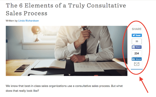
3. Use fewer social sharing buttons to increase sharesSound like a counterintuitive bit of advice? It's not. The reason behind this is a little thing called Hick's Law. Hick's law states that, when people have more choices, they take longer to make decisions. In some cases, the volume of stimuli can be so overwhelming that a person won't make any decision at all. If that person is on your blog, and the decision is whether (and how) to share your content, that's bad news. Take Hick’s Law into consideration on your site by decreasing the number of social share buttons associated with your blog posts. Not convinced this will help promote engagement? Neil Patel reports that, when he increased the number of share buttons on Quick Sprout from 3 to 5, his shares declined by 29%! With this in mind, look at the breakdown of your share percentages according to site. If there's a button that's not performing well, remove it and give your readers a break. Check out how HubSpot does this on one of their recent blogs: 4. Make the design of your CTA stand outThe human brain loves symmetry. Multiple studies have shown how symmetrical patterns like the markings on a butterfly's wings or the patterns of a coral reef fish are pleasing to the mind. As a marketer, though, you can take this desire for symmetry and use it to your advantage by making one key component of your website asymmetrical. That's right. Because the brain is so drawn to symmetry, making something asymmetrical serves to grab a person's attention, without making them angry or alienating them in the process. For an example of a CTA that does this well, check out how Neil Patel uses a very asymmetrical CTA button at the top of his page: While the color scheme of the button (orange, like other elements on his page) allows it to blend in, its size, shape, and font are asymmetrical when compared to the other menu items. This draws more attention and, presumably, more clicks. To bring this to your site, design the most important component of your site (your CTA button, your "contact us" button, etc.) to stand out by making it a different size, shape, or format than everything else. 5. Be interesting by being interestedPeople crave emotional connection. In 1995, scientists Roy Baumeister and Mark Leary published a paper titled "The Need to Belong: Desire for Interpersonal Attachments as a Fundamental Human Motivation." The paper stated that people need positive human interactions and long-term care and concern from other people to be happy. To apply this tactic to your marketing, seek to develop emotional connections with your readers on your web page. Why? When readers are emotionally connected to your brand, they're more likely to engage with your content, share your material, and return to your site again and again. With this in mind, here are several tips for developing an emotional relationship with your readers:
A More Engaging Blog Starts Here Writing a blog you can be proud of starts with knowing how to use psychology to make it as engaging as possible. Whether your blog is for personal or business use, these five science-backed tips will contribute to making it compelling, unique, and engaging for your audience. Dave is the CEO of Dave's Computers Inc. He writes a weekly column for Daily Blog Tips covering the best tips about blogging and Internet marketing. You can also find him on LinkedIn. Original post: 5 Psychology-Backed Design Tips to Dramatically Improve Your Blog Engagement |
| You are subscribed to email updates from Daily Blog Tips. To stop receiving these emails, you may unsubscribe now. | Email delivery powered by Google |
| Google Inc., 1600 Amphitheatre Parkway, Mountain View, CA 94043, United States | |



0 comments:
Post a Comment